Brand Identity Design for Startups That Works
Most startups do not struggle because they lack ideas. They struggle because, from the outside, they look half-formed. The offer might be good, the service might be solid, but if the brand feels inconsistent, generic or rushed, people hesitate. That is why brand identity design for startups matters far more than many founders expect. It is not just about having a nice logo. It is about looking credible enough for people to take the next step.
For a new business, first impressions carry more weight because there is no long track record doing the talking for you. A potential customer lands on your website, sees your van graphics, picks up a leaflet or spots your social media post and makes a judgement in seconds. If everything looks disconnected, trust drops. If it feels clear, professional and recognisable, you are already in a stronger position.
What brand identity design for startups really includes
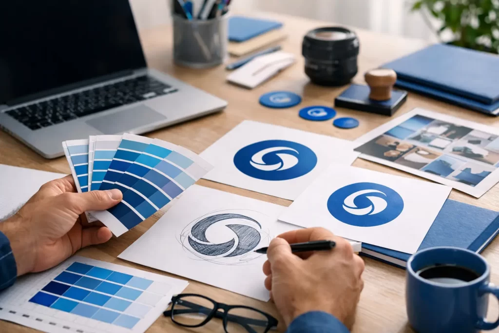
A lot of people hear the phrase and think of a logo file sitting in a folder. In reality, a proper brand identity is the visual system that helps your business show up consistently wherever customers find you. That usually includes your logo, colour palette, typography, image style, layout approach and the basic rules for how those elements should be used.
It also needs to reflect the kind of business you are trying to build. A startup plumber, café, online retailer and software company should not all look polished in the same way. Good design is not about following trends for the sake of it. It is about choosing the right visual direction for your market, your price point and the customers you want to attract.
This is where a lot of startups go wrong. They copy brands they admire rather than brands they compete with. That can leave them with an identity that looks fashionable but does not fit the reality of the business. A bold, minimal style might suit a tech startup chasing investors, but a local service business often needs warmth, clarity and instant trust more than design theatre.
Why startups cannot afford to get it wrong
When you are new, people are already weighing up a risk. They may not know your reputation yet. They may not have had a recommendation. They may be comparing you against businesses that have been around for years. Your branding has to do some of the heavy lifting.
A weak identity creates friction. Customers wonder whether you are established, whether your service is reliable or whether the quality matches the price. Even if they do not say it out loud, that hesitation affects enquiries, conversions and referrals.
A strong identity does the opposite. It helps people remember you, makes your marketing look more joined-up and gives the impression that your business is organised. That matters whether you are pitching for contracts, selling online, launching locally or trying to stand out in a crowded market.
There is also a practical side to it. If your identity is sorted early, every future asset becomes easier to produce. Your website, signage, business cards, brochures, menus, social graphics and packaging all have a clear direction. You spend less time second-guessing and less money fixing inconsistent design later.
The best startup branding is simple, not stripped bare
Startups are often told to keep things lean, and that is fair enough. But lean branding does not mean cutting everything back until the business has no personality. It means making smart choices.
The best startup identities are usually the ones that are straightforward, flexible and easy to apply. They do not rely on complicated graphics or fashionable details that date quickly. They use a clear logo, a sensible set of colours, readable typefaces and a style that works across print and digital.
That simplicity matters because startups need branding that can grow with them. If your logo only works on a dark background, your colours are too awkward for print, or your visual style falls apart on social media, it will become a headache fast. A good identity should work on a website header, a roller banner, a vehicle panel and a Facebook post without needing to be reinvented every time.
How to approach brand identity design for startups
The first step is not sketching logos. It is getting clear on the basics of the business. Who are you selling to? What do you want to be known for? Are you competing on price, expertise, speed, quality or personality? What do customers need to feel when they see your brand for the first time?
Once that is clear, the design choices become more useful. Colour is not just decoration. It shapes perception. Typography affects how premium, modern or approachable you appear. The style of imagery can make you feel polished, personal, corporate or local. None of these decisions should be random.
Then comes the question of where the identity will actually be used. This gets overlooked all the time. A startup that needs signage, print and social media graphics has different practical needs from one that operates entirely online. Your branding should be designed around real use, not ideal conditions.
It also helps to be honest about budget. Not every startup needs a huge brand package from day one, but every startup does need the essentials done properly. There is a big difference between starting with a focused, well-built identity and cobbling together cheap design that will need replacing within six months.
Where founders often waste time and money
One common mistake is asking too many people for design opinions. Friends, family and the mate who once made a logo on Canva rarely give feedback based on business goals. They give personal taste. That can send a project in circles.
Another is trying to launch with everything at once. You may not need every branded asset on day one, but you do need the ones customers will actually see. Usually that means your logo, brand colours and type, a website or landing page, and the core print or digital materials that support sales. Start there, then build out.
There is also the temptation to go as cheap as possible because the business is new. We understand budgets matter. Most startups are watching every penny. But poor branding often costs more in the long run because it affects how people respond to the business, and because redoing everything later is rarely cheap.
That does not mean the most expensive route is automatically the right one either. Brand identity design for startups should be practical. You want quality, consistency and commercial sense, not a load of jargon and a fancy PDF that never gets used.
Good branding should help you sell, not just look polished
This is the bit that matters most. A startup brand should not only look good in isolation. It should make the whole business easier to market.
If your branding is doing its job, your website feels clearer. Your brochures and flyers look more trustworthy. Your social posts become more recognisable. Your signage works harder. Your business starts to feel established even while it is still growing.
That is especially important for local startups and service businesses. In competitive areas like the North East, customers are often choosing between several firms offering something similar. A professional identity can be the difference between looking like a serious option and looking like a side project.
That does not mean pretending to be bigger than you are. In fact, smaller businesses often do better when their branding feels confident and human rather than overly corporate. People like buying from businesses that feel genuine. The trick is combining personality with professionalism.
What a startup actually needs at launch
For most new businesses, the right starting point is a brand identity that covers the essentials and leaves room to grow. That means a logo system that works in different formats, a considered colour palette, readable fonts, a clear visual style and enough guidance to keep things consistent.
From there, you can apply it to the assets that matter most to your business. For some, that will be a brochure and a few printed pieces. For others, it will be a starter website, social media graphics and signage. The exact mix depends on how you win customers.
At Grieves Design, that practical side is a big part of how we think about branding. It is not about making things complicated. It is about giving startups an identity they can actually use across websites, print and day-to-day marketing without the whole thing becoming a faff.
If you are launching a business, the aim is not perfection. It is clarity. You need branding that tells people who you are, helps them trust you and gives your business a solid footing from the start. Get that right, and everything you do next feels more joined-up, more professional and a lot easier to build on.
A good startup brand does not need to shout. It just needs to make people feel they are in safe hands.