Business Signage Design That Gets You Seen
A sign has about three seconds to do its job. Someone drives past, walks by, or spots your premises from across a car park, and in that tiny window they decide whether you look established, forgettable, premium, friendly, or not worth the bother. That is why business signage design matters far more than many businesses expect.
Good signage is not just a logo made bigger. It is a practical sales tool. It helps people find you, remember you, trust you, and in many cases choose you over the business next door. If your sign is hard to read, poorly placed, cluttered, or out of step with your brand, it can quietly cost you enquiries every single day.
What business signage design is really meant to do
The best signs do three jobs at once. First, they make you visible. Second, they tell people what sort of business you are. Third, they create a feeling about your brand before anyone has even stepped inside or picked up the phone.
That means strong business signage design is never only about decoration. It has to work in the real world – on busy roads, in poor weather, at different times of day, and at different viewing distances. A lovely design on a screen can still fail badly once it is produced at scale and fixed to a building.
This is where a lot of businesses go wrong. They focus on what they personally like rather than what customers can actually read and understand in motion. Taste matters, of course, but clarity matters more.
Why clarity beats cleverness
There is always a temptation to make signage overly creative. Fancy fonts, packed layouts, too many colours, extra wording, a slogan, a phone number, a website, social icons, opening hours – all squeezed onto one board. On paper it feels like value for money. In practice it often creates noise.
A strong sign usually says less, but says it better. Your business name, a clear service descriptor if needed, and branding that people can take in quickly will often do more than a sign trying to communicate everything at once.
It depends on the setting. A fascia sign above a shopfront can carry a little more detail than a roadside board glimpsed at 30 miles per hour. A reception sign inside an office can be more refined and subtle than an exterior sign that needs to pull attention from a distance. The job of the sign should always shape the design.
The foundations of effective business signage design
The starting point is readability. If people cannot read it quickly, the rest does not matter. Typography needs to be clean, well spaced, and suited to the environment. Some fonts look stylish up close but become a blur from even a modest distance.
Colour contrast is just as important. Pale text on a pale background may look modern, but it can be a poor choice outdoors, especially in dull weather or bright glare. Strong contrast helps people pick out your name and message fast.
Scale and hierarchy matter too. The main thing people need to know should be the most prominent thing on the sign. That sounds obvious, but many signs give equal weight to everything, which means nothing stands out. Your eye should know where to go first.
Then there is brand consistency. Your signage should feel connected to your website, printed materials, social media graphics, menus, brochures, or vehicle graphics. When all of those pieces line up, you look more established. Customers may not always notice why a business feels professional, but they do notice the result.
Designing for location, not just for looks
A sign outside a salon on a high street has different demands from one on an industrial unit, a café, a clinic, or a hotel. Good business signage design responds to where the sign will live.
On a busy high street, competition for attention is fierce. You need enough personality to stand out, but not so much clutter that the sign becomes hard to scan. In a business park or industrial estate, wayfinding often matters just as much as branding. If visitors cannot spot your premises easily, frustration starts before the meeting even begins.
Local context can shape the right approach. In places across Tyne and Wear and the wider North East, businesses often need signage that holds up against grey skies, busy roads, mixed building styles, and practical viewing conditions rather than pristine showroom settings. That usually points towards bold, legible design over anything too delicate.
Materials also come into play. Acrylic, aluminium composite, vinyl, illuminated trays, window graphics, and cut lettering all create different effects and suit different budgets. A cheaper option can still look smart if the design is right. An expensive finish will not rescue a weak layout.
Common mistakes that make signs underperform
One of the biggest issues is trying to force too much information into one space. When every service is listed, every message becomes less effective. People are not standing still reading your sign like a brochure.
Another common problem is poor logo use. Some logos work brilliantly online but need adapting for signage. Fine details, thin lines, or complicated layouts can disappear at distance. That is not a branding failure – it just means the asset needs to be used properly for the format.
Bad sizing is another trap. Businesses sometimes approve artwork on a small proof without really picturing how it will look across a wide fascia or on a tall roadside board. Spacing, margins, and proportion can change massively once something is produced at full scale.
Then there is inconsistency. A smart sign paired with tired window vinyls, outdated posters, or off-brand promotional boards creates a mixed message. Customers often judge the whole business by the weakest visible element.
How signage supports sales, not just appearance
There is a reason established businesses invest in signage even when they already have a website and active social media. Physical visibility still matters. A good sign keeps working whether you are open or closed, whether people are searching for you or not.
For local businesses especially, signage often creates the first impression that leads to a later enquiry. Someone notices your premises on their commute, remembers the name, then checks you out online that evening. In that sense, signage and digital marketing are not separate things. They support each other.
This is particularly true for trades, hospitality, health and beauty, retail, and service businesses that rely on local recognition. If your branding looks polished on the street, people are more likely to trust what they see on your website. If the sign looks amateur, that doubt can follow them online too.
When simple is the right call
Not every business needs dramatic illuminated lettering or a heavily styled frontage. Sometimes the best option is a straightforward, well-made sign with strong typography, consistent brand colours, and enough presence to be seen clearly.
That can be the right move for startups, smaller firms watching budgets, or businesses in shared buildings where signage options are limited. The aim is not to overdesign. The aim is to create something clear, professional, and fit for purpose.
A lot of businesses are relieved to hear that. Effective signage does not have to be flashy to work. It just needs to look like you know what you are doing.
A better way to approach your sign project
Start with the practical questions. Who needs to see the sign, from what distance, and in what conditions? Is the main job to attract passing trade, help people find the premises, reinforce branding, or all three? Once that is clear, design decisions become easier.
From there, think about what absolutely must be included. Usually that is your business name and brand identity, with a short supporting line if your offer is not obvious. Anything beyond that should earn its place.
It also helps to think bigger than the sign itself. If you are refreshing your signage, it may be the right time to tighten up matching print, menus, flyers, banners, or your website so the whole customer journey feels joined up. That is often where the real value sits – not in one isolated design job, but in a brand that finally looks consistent everywhere customers encounter it.
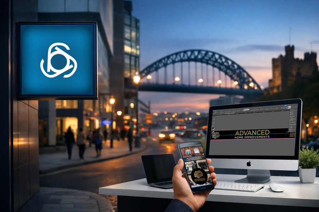
If you want a sign that works hard instead of simply filling space, it pays to treat it as part of your marketing, not an afterthought. At Grieves Design, that practical approach is exactly what helps businesses get visible without making the process feel overcomplicated.
A good sign does not need to shout. It just needs to be clear enough, confident enough, and well judged enough that the right people notice you and remember you when it counts.