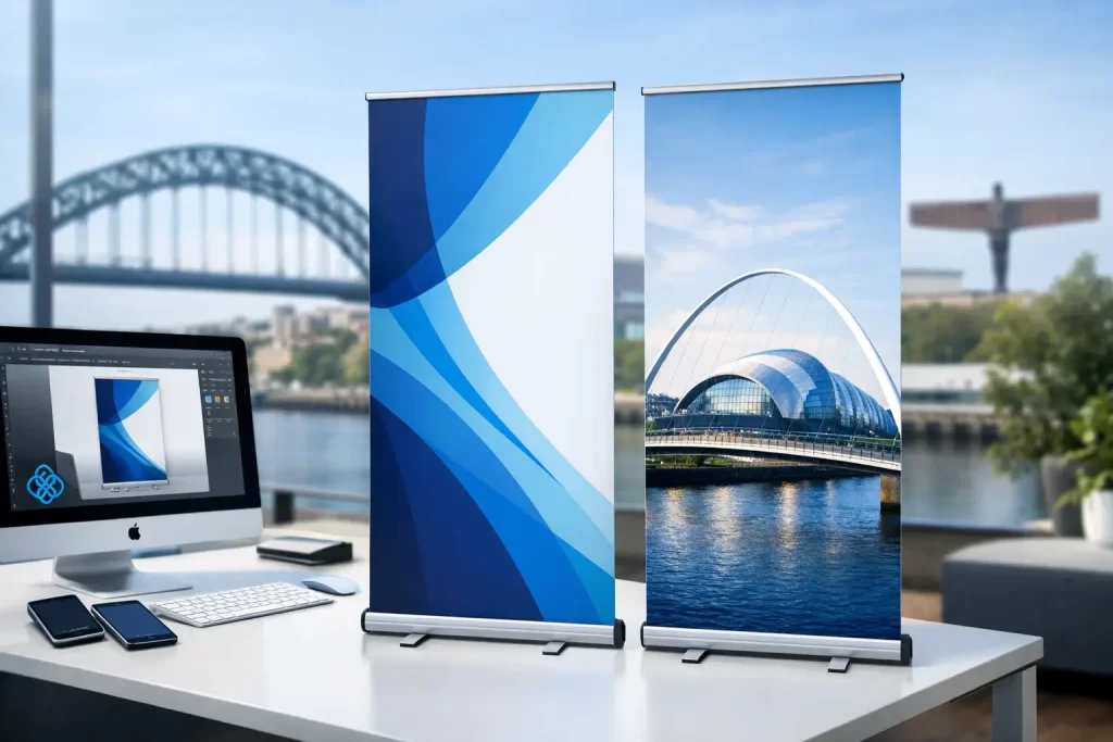
Roller Banner Design Printing That Gets Seen
A roller banner gets about three seconds to do its job. That is usually all the time you have at an exhibition, in a reception area, at a trade counter or beside a promo stand. If your roller banner design printing is cluttered, hard to read or poorly set up for print, people will walk past without taking in a thing.
That is why a good roller banner is not just a larger version of a flyer. It has a different job to do. It needs to grab attention from a distance, make sense in a glance and still look polished close up. When all three come together, a roller banner becomes one of the hardest-working pieces of print you can buy.
What makes roller banner design printing effective
The best roller banners are simple, bold and focused. They do not try to explain your whole business in one panel. They pick one message, support it with strong branding and guide the viewer towards a clear next step.
That sounds straightforward, but it is where many businesses go wrong. They squeeze in too much copy, use images that are too soft for large-format print, or place important text too low where the stand mechanism cuts it off. Good design is not about filling space. It is about using space well.
A roller banner should usually answer three questions quickly. Who are you? What do you offer? What should someone do next? If those answers are easy to spot from a few metres away, you are on the right track.
Design for distance first, detail second
People rarely stand directly in front of a roller banner and read it top to bottom. More often, they catch part of it while walking past. That means your headline needs to work at distance, your main visual needs to support the message instantly, and your branding needs to be obvious without taking over.
This is where hierarchy matters. A strong headline at the top will do more work than a paragraph in the middle. A short supporting line can add context. Contact details, a website or a QR code can sit lower down for people who want to act on it.
There is always a trade-off between detail and impact. If you are promoting one service, one offer or one event, keep it lean. If the banner is for a showroom or reception and will stay up longer, you can include a bit more information. Even then, less usually works better.
The headline is doing the heavy lifting
Your headline is not the place for vague wording. “High Quality Solutions” could mean anything. “Kitchen Installations Across the North East” tells people exactly what you do. Clear beats clever most of the time.
The strongest headlines tend to be short, direct and benefit-led. They make sense on their own, even if someone only reads that line and nothing else. That is a good test when reviewing any banner concept.
Images need to earn their space
One strong image will usually outperform several average ones. If you are using photography, it needs to be high resolution and relevant to what you actually sell. Stock images can work, but only if they feel believable and fit the rest of your branding.
For some businesses, no photo is better than the wrong photo. A clean layout with bold typography, a solid colour palette and a clear logo can look far more professional than a crowded banner full of unrelated visuals.
Common roller banner mistakes that cost you attention
The biggest mistake is trying to say everything. A roller banner is not a brochure, and it is not your website. If you load it with service lists, long sentences and too many design elements, the message gets lost.
Another common issue is poor sizing. Text that looks fine on a screen can feel tiny once printed if the layout has not been planned properly. The same goes for logos and calls to action. If they are too small, too low or too close to the edges, they lose impact.
Then there is the print setup itself. Roller banners have visible and hidden areas. The bottom section sits inside the stand, so anything critical placed there will disappear. Safe margins matter too. A design can look tidy on screen but feel cramped in print if the artwork has not been prepared with the final product in mind.
These are the details that separate a banner that looks “fine” from one that feels sharp, well made and worth taking seriously.
Roller banner design printing is not just about looks
A good-looking banner is useful. A banner that is designed for how people behave is far more useful. That means thinking about where it will be used, how long people will see it for and what action you want them to take afterwards.
At an exhibition, you may need a bolder message because attention is limited and competition is high. In a reception area, the banner can be slightly calmer and more brand-led. In retail, promotions and pricing may matter more. For events, dates and key details need to stand out fast.
It depends on the setting, which is why cookie-cutter design rarely gets the best result. A roller banner for a trades business will not follow the same approach as one for a hotel, healthcare provider or local café. The right design starts with the purpose.
How to get the print side right
Design is only half the story. Print quality changes how your banner is perceived. Crisp text, accurate colour and durable materials all affect whether the final piece looks professional or disappointing.
Artwork should be set up at the correct size, in high resolution and with the right bleed and safe areas. Colours need to be checked with print in mind, because screens and print output do not always match. Fine lines, pale tints and low-contrast text can all cause trouble once ink hits material.
Material choice matters too. Standard banners are ideal for many everyday uses, especially if budget is a factor. Premium options can give better stability, stronger colour reproduction and a more durable finish if the banner will travel regularly or be used repeatedly.
That is why roller banner design printing works best when the design and print are treated as one job, not two separate decisions. If the artwork is created with the final stand, material and use case in mind, the result is stronger from day one.
Size changes the message
A standard width works well in many spaces, but wider banners can create more presence if you have the room. The catch is that more space often tempts people to add more content. Bigger format should not mean busier design.
The larger the banner, the more important balance becomes. Empty space is not wasted space. It helps key messages stand out and gives the whole layout a more confident feel.
What businesses should include on a roller banner
Most businesses need a logo, a headline, a supporting message and one clear contact route. That might be a phone number, website, QR code or a short call to action. If relevant, you can add trust signals such as awards, years of experience or recognisable client sectors, but only if they strengthen the message rather than clutter it.
If you offer multiple services, choose the ones that matter most to the audience in that space. A builder at a local expo may want to push extensions and renovations rather than list every service under the sun. A salon may want to highlight one treatment, one offer or one booking prompt.
The best banners are selective. They know what to leave out.
Why professional design usually pays for itself
A roller banner is often used again and again. It goes to events, sits in shop floors, appears in reception areas and helps support sales conversations. Because it lasts, poor design has a habit of lasting too.
That is why investing in proper artwork is usually the cheaper option over time. A professionally designed banner is more likely to reflect your branding properly, print cleanly and stay useful across different settings. It also saves the hassle of reprinting because something was missed, stretched or placed in the wrong area.
For businesses that want a straightforward process, working with a design and print team that understands both sides makes life easier. You are not left guessing on sizes, file setup or whether your logo will print sharply. You get something that is built to work in the real world, not just on a laptop screen.
At Grieves Design, that practical approach is a big part of the job. It is not about making things complicated. It is about giving businesses roller banners that look smart, feel on-brand and help them get noticed for the right reasons.
The smartest question to ask before you print
Before you approve any banner, ask this: if someone only looked at it for two seconds, what would they remember?
If the answer is clear, you are close. If the answer is “well, hopefully they would read the middle section”, it needs more work. Good roller banner design printing is not about squeezing in more. It is about making the right message impossible to miss.
That is often the difference between a banner that fills a space and one that actually helps grow the business.